Icons for Graph on Toolbar
“Edit Plots for the Current Graph” button ![]() , allow the user to modify the plots, such as add data plots with mouse drag and drop to set up x and y of the new plot as shown in Figure 1, delete data plots using button
, allow the user to modify the plots, such as add data plots with mouse drag and drop to set up x and y of the new plot as shown in Figure 1, delete data plots using button ![]() , exchange x and y of the plots using button
, exchange x and y of the plots using button ![]() . The available columns can be imported from a file or from Clipboard if the check box in front is selected.
. The available columns can be imported from a file or from Clipboard if the check box in front is selected.
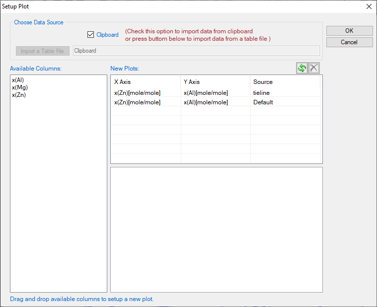
The table file to be imported can be Pandat™ table format or ASCII text format. For a general Microsoft Excel table, the user can copy the selected columns in the Excel file and check the Clipboard option, and then the column names will show up in the “Available Columns” dialog for the user to select, which is also shown in Figure 1. User can also copy the data from the table columns in the Pandat™ calculation results.
-
Select Objects button
 , allow the user to select drawing elements in a graph such as line, arrow or text.
 -
Zoom Mode button
 , use the Zoom mode to enlarge a small part of a graph. Hold the left button of the mouse and move the mouse to select a rectangular area on the graph to enlarge. The graph will zoom in to the selected area when the left button of the mouse is released. Double click this button will bring the zoom image back to the whole diagram again.
 -
Pan Mode button
 , when this mode is on, put the cursor on the plot and roll the mouse wheel to enlarge or shrink the graph, keeping the current center of the graph unchanged. Hold the left button of the mouse on the graph and move the mouse, the user can move the whole graph.
 -
Label Phase Region button
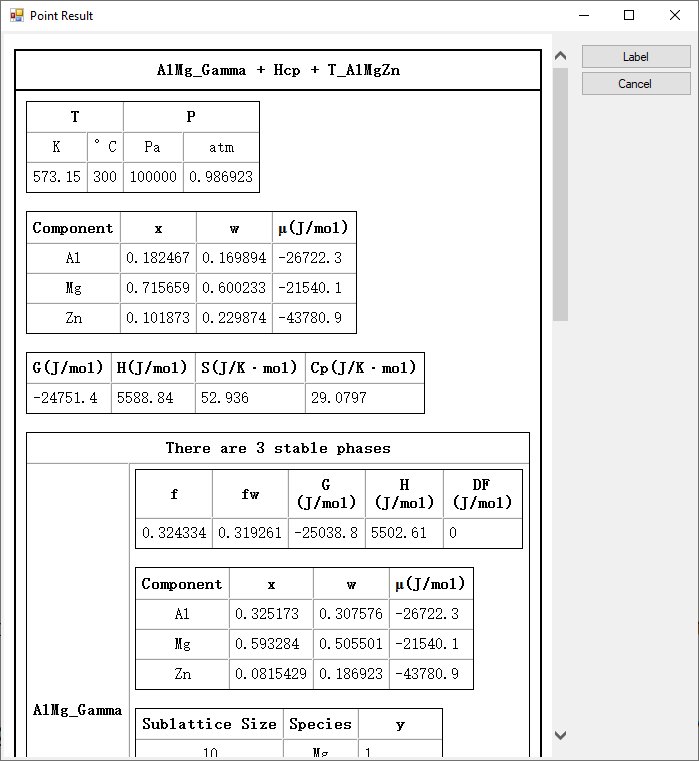
 , label the graph with text. Pandat™ can not only label the normal T-x or x-x phase diagrams from calculations, but also label those user generated graphs using the table data from calculation, i.e., G-x and μ-x diagrams. The user can modify the labeled text like normal text. If the user holds the <Ctrl> key first and then click the mouse on the diagram with the function, the program will do a point calculation at the composition and temperature where the cursor locates. A new window will pop out to show the calculated result in detail as shown in Figure 2. The user can choose Label after reading or Cancel to close this window.
 -
Add Legend for Graph button
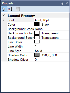
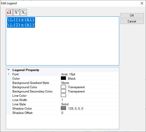
 , add legend to the graph. The user can modify the legend using the Property window, as shown in Figure 3(a). Double click on the inserted legend will open a new Text Editor window as shown in Figure 3(b), and the user can input complex text, such as symbol, superscript and subscript in this windows.
 -
Add Text or Label button
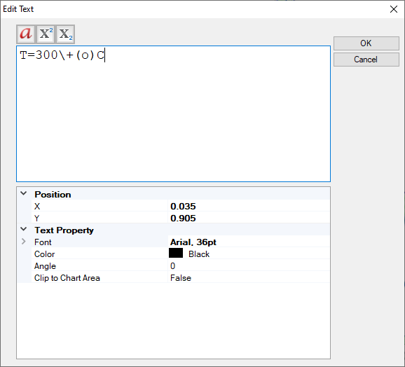
 , add text to the graph. Change the text content, size, color and rotating angle in the Property window. Double click on the text also open the Text Editor window which allows user to input complex text in it as shown in Figure 4
 -
Add Line button
 , add line with or without arrow to the graph. Change the line or arrow width and color in the Property window. The default line has one arrow at end of the line. User can set the start cap and end cap in the Line Property window as shown in Figure 5